New York City Luxury Condo
35 Hudson Yards
Photography by Travis Mark.
Sixty-four floors up.
This project was 90% completed within thirty days during Covid-related delays, including the installation of a four hundred pound Alison Berger chandelier.
To achieve this quick turnaround, only selections that were in-stock and ready to ship were considered. A neutral color palette was employed to allow the client’s magnificent collection of over-dyed vintage rugs and colorful artwork to shine.
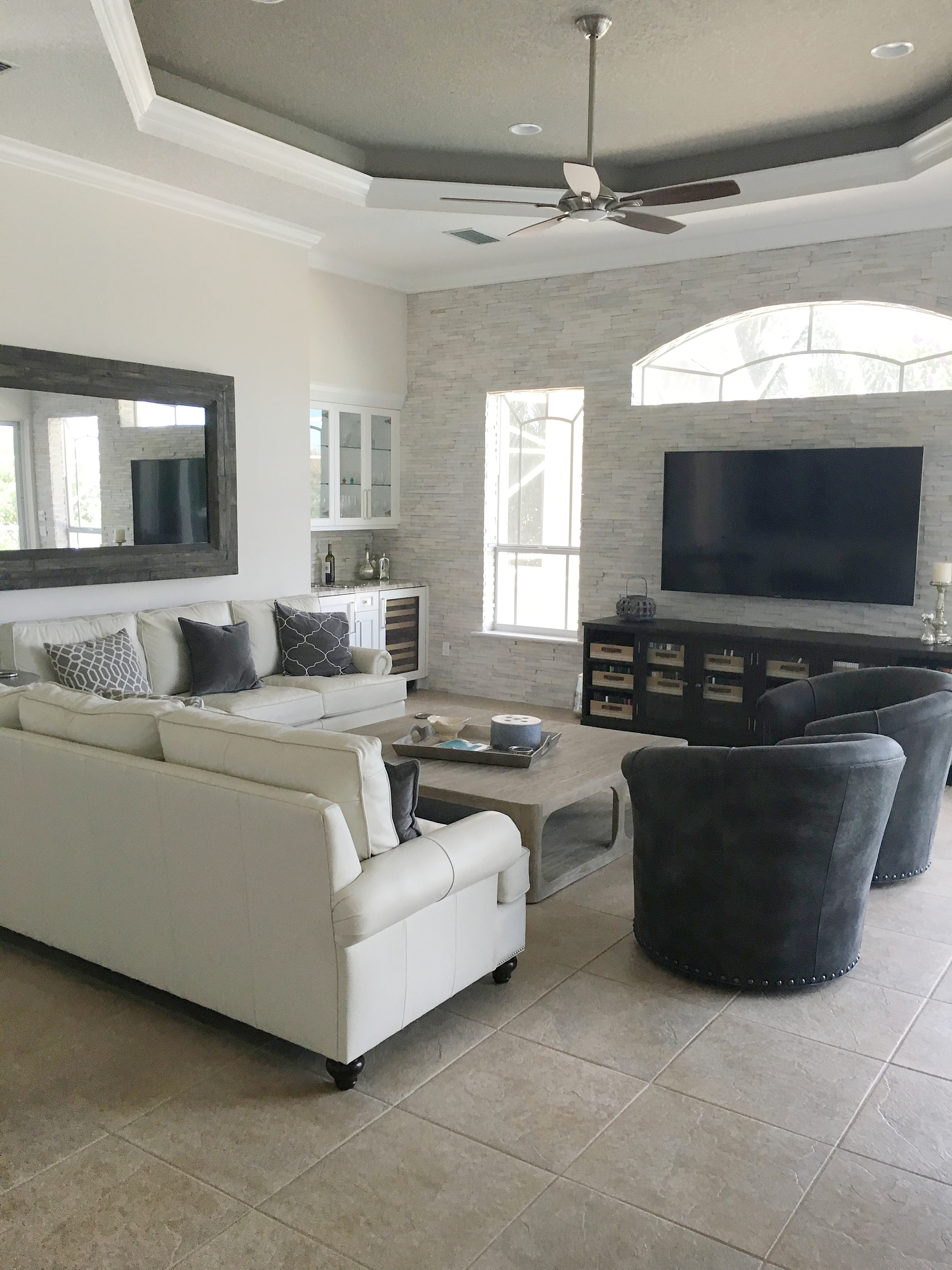
lakeside florida home
This 4,300 sqft. home had a dated, mediterranean-inspired style that felt a little heavy for its sunny beach locale. Now it's been brought up to speed by bringing cooler, fresher tones to the space, allowing the light to shine through and show off the home's new cleaner lines.
Hutchinson Island Beach Condo
This condo got a head-to-toe makeover. Every finish, piece of furniture, and architectural detail you see in these photos is brand new. The space used to have wall to wall aqua carpeting and matching wall paint.....so needless to say the transformation is a big one! The result is a formal twist on beach house comfort.
staging an Austin Airbnb rental
The client wanted to make his investment property look more appealing to renters without breaking the bank. A few trendy styling choices make this home feel current and inviting, while remaining practical and durable for out of town guests.
Pssst.....less than $1,500 was spent on this project!
The client was already renting out the space while only having mattresses on the floor, so we knew the investments could be minimal. The result is a clean, hotel-like feel.
small space solutions
A tiny one-bedroom apartment in Brooklyn presented some design challenges, most notably a large, awkward structure in the corner of the living space that was actually the ceiling of the stairway down to the basement from the exterior of the building. Now, repurposed as a seating area, it looks like that's what it was always meant to be.
Custom cushions and pillows gave this bizarre block of cement a purpose as a welcoming seating area.
The mirror and marble table are family heirlooms, refinished in black lacquer for some drama.


