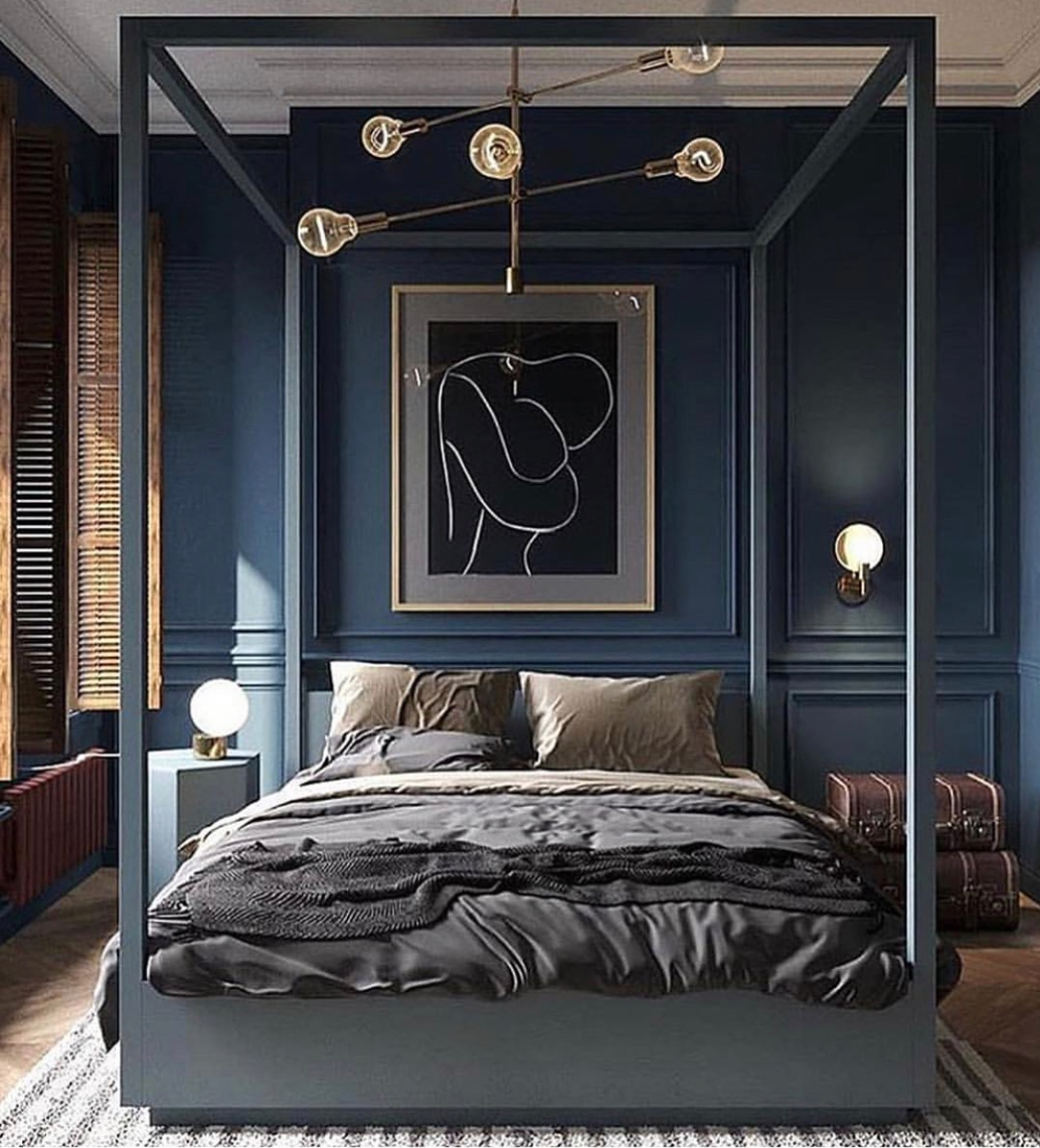
home decor inspo

How My Ugly Backyard Became My Favorite Place in My Home

Good things take time.

I started this backyard renovation a year ago, and now just in time for summer, I finally get to share the finished product with you!

But before we dive in, I have to thank Jeffery Miller and Jonathan Starkey for making this all happen. I’m pretty sure building an outdoor deck out of the kindness of their hearts qualifies them as the best friends ever. I watched them work so hard out in the hot Texas sun, mosquitos attacking them incessantly, just to make my vision come to life. It truly is one of the nicest things anybody has ever done for me. It’s also really fun to have this memory with my best friends, seeing the project through every stage, and now getting to enjoy the fruits of our (their) labor.

Let’s take a walk down memory lane, Shall We?…

This is what my backyard looked like when I first moved in.

IMG_4306.jpg

On top of being just plain unsightly, the ground sloped in such a way that the yard felt unusable. I used to look out at this view and think, what a small, ugly waste of space.

For a long time I considered laying pavers out on the ground. That’s what most of the neighbors had done and it was where my brain naturally went first.

But I was looking out there one day and realized that the concrete patio was the only part that felt truly usable because it was level. This is when I got the idea: a deck across the whole yard, which would not only create an even level, but it would also eliminate the grass which, let’s be honest, I didn’t need. I’m a millennial with no kids, no pets, and PTSD from a bug infested Brooklyn apartment. No grass = less bugs = happy Regina.

(PS: If you look closely, that’s hardly even grass. It’s mainly weeds. I really wasn’t going to miss it.)

Before we got started on the deck itself, we began to clean up the yard and added some string lights, which I knew I wanted far in advance. I love them for ambience. You can see from the photo below that we removed all of the original mismatched landscaping and put in these boxwoods that were transplanted from someone’s yard who didn’t want them. Unfortunately, they didn’t take and ended up dying, but they were great (and free) placeholders while we worked on the rest of the yard!

IMG_1131.jpg
Jonathan attaching my string lights from my roof. Don’t try this at home, kids.

Jonathan attaching my string lights from my roof. Don’t try this at home, kids.

IMG_1355.jpg
I remember feeling so excited about the progress this night. Lighting makes such a difference.

I remember feeling so excited about the progress this night. Lighting makes such a difference.

Bradley (Jonathan and Jeffery’s dog) seemed to like it, too.

Bradley (Jonathan and Jeffery’s dog) seemed to like it, too.

The next step was pressure washing. The concrete pad and wood fence really needed some TLC.

I find this photo to be very satisfying. You can really see what a difference pressure washing makes. Jeff always talks about enjoying the instant gratification of it, and now I know what he means!

I find this photo to be very satisfying. You can really see what a difference pressure washing makes. Jeff always talks about enjoying the instant gratification of it, and now I know what he means!

We also pressure washed the perimeter fence, and went over it with a clear protective sealant. It was a simple way to really improve the appearance of the aged wood.

You can really see the line of demarcation between my fence and my neighbor’s to the left.

You can really see the line of demarcation between my fence and my neighbor’s to the left.

Not cute.

Not cute.

More than anything, I HATED staring at that terribly ugly concrete wall. It was weirdly stained with sediment that seemed to leak through the wall, the color of the concrete wasn’t consistent, and I just couldn’t imagine any amount of dressing up my backyard that would make me like or even tolerate it.

So I painted it! But not just with any paint - I used a deck-smoothing paint that filled in some of the concrete texture and made everything look much more polished.

At times it felt more like smearing putty around than painting, but the result was worth the effort.

The top right brick that has more texture in this photo has only normal paint on it - just to illustrate what a great job the deck smoothing paint did.

The top right brick that has more texture in this photo has only normal paint on it - just to illustrate what a great job the deck smoothing paint did.

IMG_4907.jpg

Next, we installed the trellis structure, which involved some concrete screws and rubber-coated wire. Very simple.

We planted the star jasmine vines at the base of our trellis design and wound them through it. It was kind of fun to do, and the vines take so easily to it since they need something to grow onto.

IMG_5045.jpg
IMG_5142.jpg
IMG_5144.jpg

As the vines grew, I periodically stepped outside to ensure they were winding up the wire correctly and guided them in the right direction. Months later, the vines bloomed in the spring and looked like this:

These smelled so incredible. I can’t wait for them to bloom again next year. :)

These smelled so incredible. I can’t wait for them to bloom again next year. :)

IMG_7765.jpeg

The Deck

Jonathan was the engineering brains behind the deck, the construction of which involved digging holes to set concrete footings, building out a frame, and then installing supportive beams, all while ensuring everything was perfectly level. It was a laborious process and not even remotely something I’d be able to tackle by myself.

LOL here’s me “helping.”

LOL here’s me “helping.”

I chose the widest planks I could find from Home Depot, because I felt that would give the deck a more modern feel. I fully stand by that decision looking at the end product now.

[ For some insights into the hilarity that was transporting all of this wood from Home Depot, check out my Instagram highlight entitled Backyard Beautiful. ]

I wanted to somehow hide the AC unit, so the boys built a fence around it, which has the added benefit of helping to cancel out the noise it emits as well. The fence also provided a space to hide a little storage unit where I can put all of my furniture covers when they’re not in use.

IMG_7368.jpg
IMG_7370.jpg
IMG_7379.jpg

Choosing the deck color was a challenge! I arrived at the current color by trial and error.

You can see the off-white square test patch at the bottom of the deck.

You can see the off-white square test patch at the bottom of the deck.

In an effort to try to make this space feel like a continuation of my living room, I first toyed with the idea of painting it light to match my white concrete floors on my first floor. White is a tricky color…because white is never just white. White can be pink, green, yellow (etc) depending on the lighting, and outside where the light changes multiple times a day, I couldn’t nail down one that worked for me. I also eventually admitted to myself that white would be insane to keep clean.

Then I thought I’d try to match my wood fence, because I was afraid of having too many different elements out there. But the stains all kept looking off.

To illustrate what lighting can do to color, these are some stains I tested.

To illustrate what lighting can do to color, these are some stains I tested.

These are the same stains outside.

These are the same stains outside.

Eventually, I just went with my gut and picked a rich chocolate brown - because I loved it. The brown makes everything look so crisp out there. I was a little concerned that it was going to look too dark combined with the charcoal grey, but it doesn’t at all. It feels elegant, which is what I was hoping for.

The chocolate brown in direct sunlight.

The chocolate brown in direct sunlight.

The chocolate brown in indirect sunlight.

The chocolate brown in indirect sunlight.

I really had fun painting the deck! I played some music out there and kind of got lost in the back and forth strokes. I then painted the concrete pad the same charcoal grey as the wall, using the same deck-smoothing product. It gave the concrete a more uniform, upscale feel.

And just like that, the hard stuff was complete.

Furniture AKA The Fun Stuff

  As I said earlier, I really treated this space as an extension of my living room. I knew I wanted to see a continuation of my black and white color scheme. I envisioned having parties where I opened up my sliding glass doors and experienced it all as one expansive space. I wanted it to be a space that I truly felt compelled to use often, so it was important to me that I stay true to my preferences, and not just choose things because I had some preconceived notion of what an outdoor space “should” be.

IMG_8714.jpeg

Austin is known for its distinctive modern residential design, with clean lines and typically a zero-scaped yard. I wanted to incorporate some of that style while still staying true to my personal tastes. You can see a little bit of ATX flair in the Acapulco chairs, the simple-form end table, and the wire sofa frame. But the black and white palette - that’s all me.

IMG_8457.jpeg
IMG_8711.jpeg

The furniture in the seating area and the dining chairs are all from CB2. The extendable dining table is from Lowe’s, the fire table (and pretty reflective glass rocks) are from Home Depot. The rug is from Grandin Road, and the planters are from At Home. I ordered the topiaries off of Amazon!

IMG_7998.jpeg

It’s now become my favorite place to be. If the weather cooperates, I’m out here at least once a day. It’s so pleasant to get my work done out here (and yes, we ran power to the back corner so there’s a usable outlet by the table).

IMG_8689.jpeg

I feel like I’ve added some serious value to my house, but more than anything, it’s added serious value to my quality of life. Coming out here for a little dose of sunshine in the morning with a cup of coffee, having a glass of wine at night by the fire, or dining outside with my friends - it’s the experiences that I get to have out here now that matter the most to me.

IMG_8575.jpeg

Cheers to an amazing summer, and even more amazing friends!

Xo, RAD

Upcoming Design Trends for 2019

Happy Sunday, everyone! The new year is just around the corner (literally tomorrow night!), and it’s got me thinking about all the possibilities and new trends we may start to see in 2019. If you’ve got some home projects on your mind that you’d like to tackle in the upcoming year, I hope this blog post helps you find new ways to approach designing your home!

pantone-living-coral-content-2018.jpg

COLOR

Every year, Pantone releases the color of the year, and this time it’s a bright pinky-orange called Living Coral. However, it’s widely predicted that people will lean more toward the use of darker, moodier colors in the new year, like navy and forest green. In general, the idea is to go bold.

Color experts say it is a reaction to the bright white that has dominated the design world for the past several years. Just like fashion, the pendulum of design always swings, and in this case it’s swinging from all white spaces - like popular kitchens the last few years - to rich, deep hues being used in big ways. 

Jon de la Cruz via Farrow and Ball’s Instagram.

Jon de la Cruz via Farrow and Ball’s Instagram.

Cartelle Designs via Ashley Stark on Instagram.

Cartelle Designs via Ashley Stark on Instagram.

Rendering by Batsmanova Design

Rendering by Batsmanova Design

We are also moving away from the heavy use of cooler greys that we saw so much of in recent years. Grey is still a great staple, but choosing a neutral or warm undertone rather than cool will better compliment the jewel tones we’ll be seeing so much of.

Matte black is really the new grey! In architectural finishes, appliances, and furniture.

Magnolia Construction via Joanna Gaines’ Instagram.

Magnolia Construction via Joanna Gaines’ Instagram.

UFO dining table by Emmemobili.

UFO dining table by Emmemobili.

Source unknown.

Source unknown.

Design by Montana Labelle.

Design by Montana Labelle.

TAKING BOLD RISKS
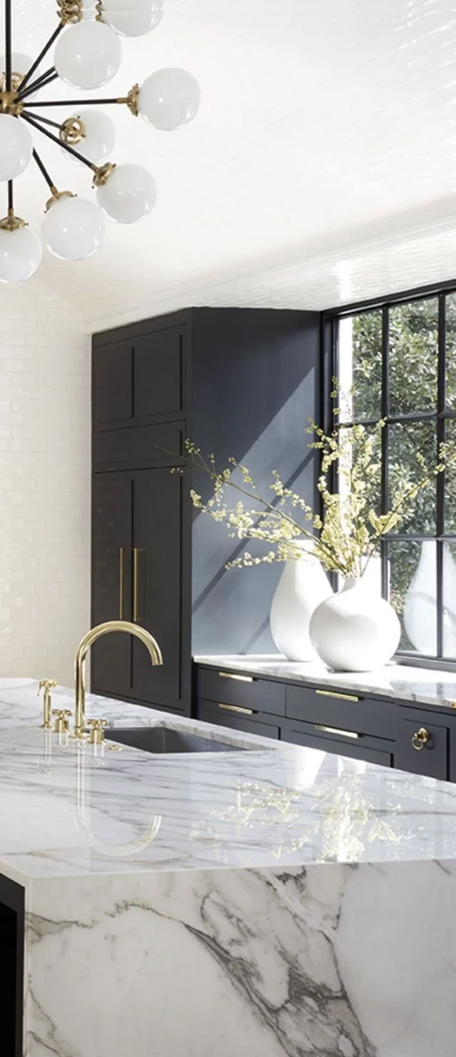
Thanks to technology and social media, the way people can see design has changed, which has changed what people want. Clients no longer have to imagine what an idea will look like – they actually can see it on visual social networks such as Houzz, Instagram, and Pinterest. This has helped people become more comfortable with the idea of experimenting with bold use of rich, dark colors. 

 "If you tell somebody, 'Paint your walls dark blue or black,' people might imagine the Addams family house. But when they see a photo of the design and how these colors create a warm and serene setting, they are much more likely to have the confidence to try it.”

- Mitchell Parker, writer and editor for Houzz, via The Washington Post

Deep jewel tones are showing up in big ways, like on entire walls including baseboards and trim in some cases, kitchen cabinets, large main pieces of furniture – like living room sofas, and also BEDS! 

SPEAKING OF BEDS…

Winged Velvet Bed via avenue-road.com.

Winged Velvet Bed via avenue-road.com.

Upholstered headboards in sumptuous fabrics and velvets are where it’s at. They add sophistication and drama. But moreover, people want to feel comfy in their bedrooms, like they have a cozy private retreat where they can be engulfed by soft fabrics – so no more cold metal beds.

Joy Moyler Interiors.

Joy Moyler Interiors.

Historically, trends like this come about when there are periods of unrest in the outside world, and people want their homes to feel like a safe and comfortable escape.

Footboards make people feel protected and nurtured while they sleep, so rooms that have enough space for that would do well with a cozy, substantial bed that wraps you in on both ends.

I don’t personally care much for the rest of the decor in this photo, but I think we’ll be seeing a lot of this shape of bed.

BLUSH 

Blush is one color that isn’t going anywhere yet. It’s the new neutral, and it’s the perfect compliment to all of the deeper tones we’ll be seeing - and good thing, because it’s our biggest guilty pleasure! It can be combined with bold colors like navy, forest green, oxblood, or even citrine, all while allowing the bolder color to stand out and be the star.

This room by Arent&Pyke features a blush rug that perfectly compliments the curved, sculptural navy blue velvet chair.

This room by Arent&Pyke features a blush rug that perfectly compliments the curved, sculptural navy blue velvet chair.


CURVY DESIGNS

goop x CB2 Collection

goop x CB2 Collection

Grace Serpentine Sofa from Anthropologie in Forrest Velvet

Grace Serpentine Sofa from Anthropologie in Forrest Velvet

1970’s-inspired curvy, rounded furniture will continue to take over. Rounded back chairs, curved or serpentine sofas. Sleek but organic.


Scout Design Studio.

Scout Design Studio.

IT’S ALL IN THE DETAILS

Small details in upholstery have a big impact on design. Seams, piping and contrast stitching all create uniqueness and add a level of perceived value. A little bit more effort is shown in the craftsmanship of the piece, which buyers are appreciating.

MIDCENTURY MELTDOWN

No more mid-century EVERYTHING. It can still be great when used in moderation, but not overdone to the point where walking into your living room feels like a time warp. In general, homes will feel more eclectic, more “collected” instead of one forced style.

e9da4c4403d1764a5ca00dbea1cf7676.jpg

One reemerging style is ART DECO, and you’ll see its influence in furniture silhouettes and also textiles and prints. Just like bold paint is in, so is WALLPAPER– especially in small powder rooms or on one major accent wall, and you’ll see some art deco influences in those patterns as well. I’ve even seen recent installations of wallpaper on the ceiling (see below) – it’s coming back in a big way. Gone are the days when wallpaper was just for your Grandma’s house!

Patterns will be slightly cleaner – so moving away from the Morrocan and tribal trends of the last couple of years. Bohemian patterns will still be available in a more bold, sharp way. Even floral patterns will be seen, and may be abstracted or blown up to a larger scale.


via ArchZine.

via ArchZine.

a4dc19bac9ef3e7c161bdf6d130102e4.jpg
Jackson Paige Interiors.

Jackson Paige Interiors.

spa accessories.jpg

SPA-LIKE DESIGNS

 As wellness trends turn towards “self-care” and “self-love,” more and more people are prioritizing quality relaxation time after a long day of work, so we’ll be seeing more spa-like designs.

People no longer see the bath as a purely utilitarian space (in general, design is moving away from anything too industrial). We are all looking for spaces that foster relaxing experiences. But you don’t have to spend a ton of money and do a full bathroom remodel - you can create this with your choice in spa-like accessories, bath tub accoutrements, extra comfortable bath mats and towels, statement artwork, and mood lighting or candles.

Jean Louis Deniot.

Jean Louis Deniot.

BE A COLLECTOR

In line with the more “collected,” eclectic look, people will be willing to invest in handmade, unique pieces. Or even if they’re not one of a kind, manufactured items with an amazing backstory or design development will be of interest. People want to know where their pieces come from and want to use them as interesting talking points.

Vintage is in, antiques are in, and MIXING those pieces with new trendier items grounds the overall design concept and give people’s homes a little history - a more well-rounded feel.


At the end of the day, what matters is that YOU love your space. You don’t have to subscribe to the trends, and as you all know, history repeats itself and style comes full circle all the time. We’re constantly responding to what we did previously, trying to update our look and keep things fresh in the design world. Instead of feeling the pressure, have FUN with it! Get creative and don’t take life too seriously. :)

And on that note, have an absolutely FABULOUS New Year!! I can’t wait to connect with more of you in 2019, and I wish for you all good health, happiness, and homes that you love. <3

Xo, Regina